Zann Commercial
Services:
Visual Identity
Year:
2023
Industry:
Commercial Real Estate
When a new principal broker took the helm of Zann Commercial, inheriting both a company and decades of community trust, the challenge was clear: honor the legacy while signaling a fresh era. Zann had built an enviable reputation in Texas's commercial real estate market, anchored by a distinctive teal that had become synonymous with the brand. But a change in leadership demanded a visual language that reflected the next generation, one that respected the past without being bound by it. The task required balancing respect for the established brand with the vision of new leadership to take the company into its next chapter.

Before

After
The Challenge
Ownership transitions in commercial real estate are often invisible to clients. Without a clear visual marker, the market can struggle to understand what's changed and why it matters.
Zann needed a rebrand that accomplished three things simultaneously: maintain the brand equity built over decades, signal a generational shift in leadership and vision, and establish a modern identity that would resonate with a younger generation of investors and tenants.
The risk was alienating existing relationships. The opportunity was positioning Zann as forward-thinking while remaining grounded in proven expertise.

The Strategy
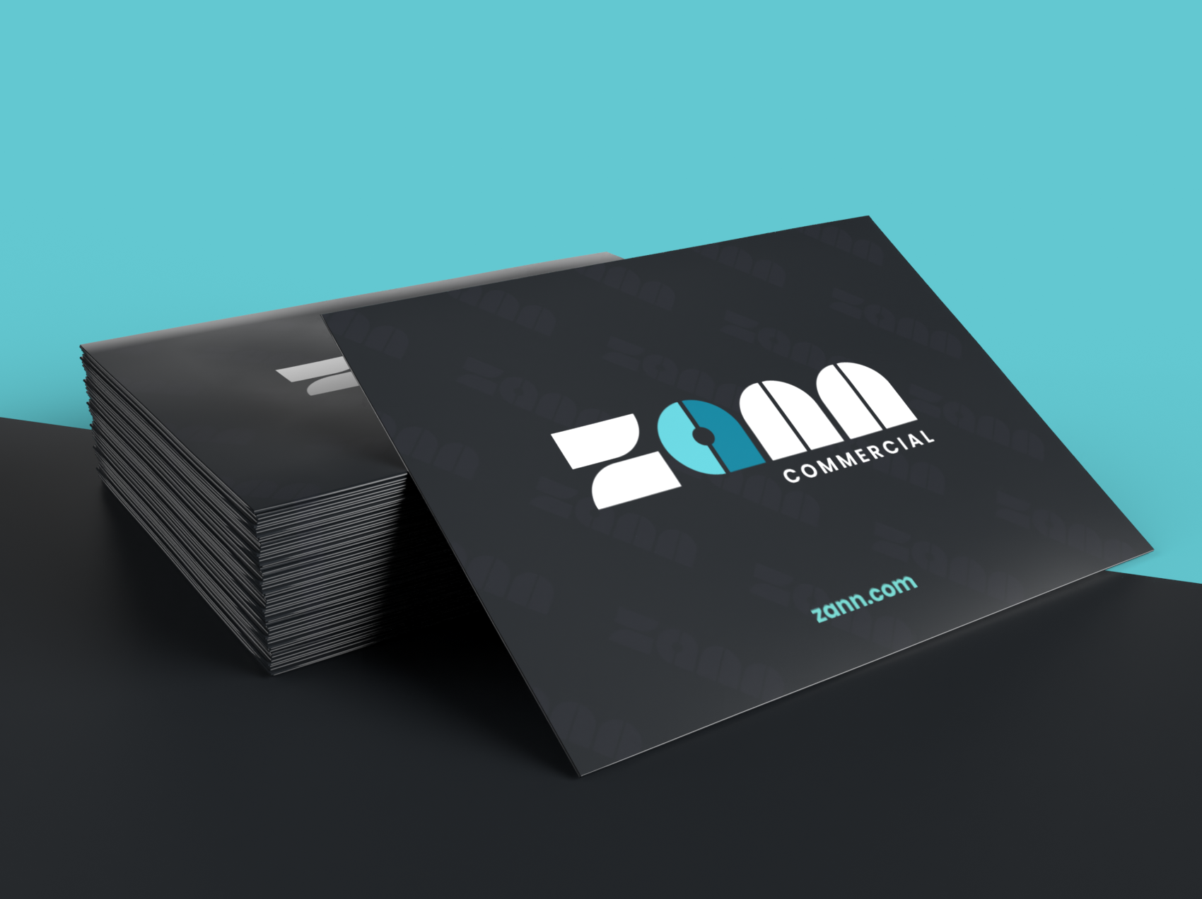
Rather than abandon the iconic teal that defined Zann, we made it the anchor point for evolution. We developed a contemporary visual identity rooted in the principal broker's personal aesthetic, a love of 70s and 80s design sensibility.
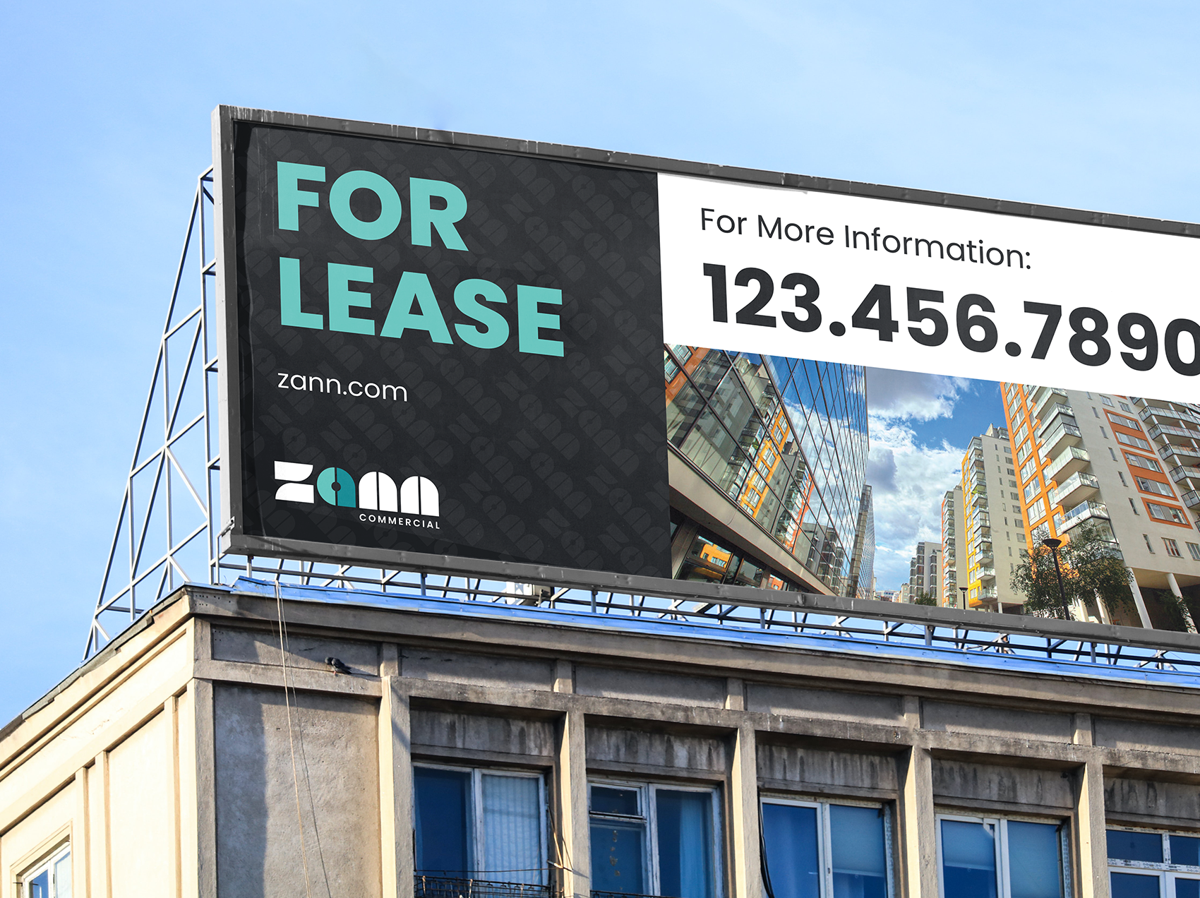
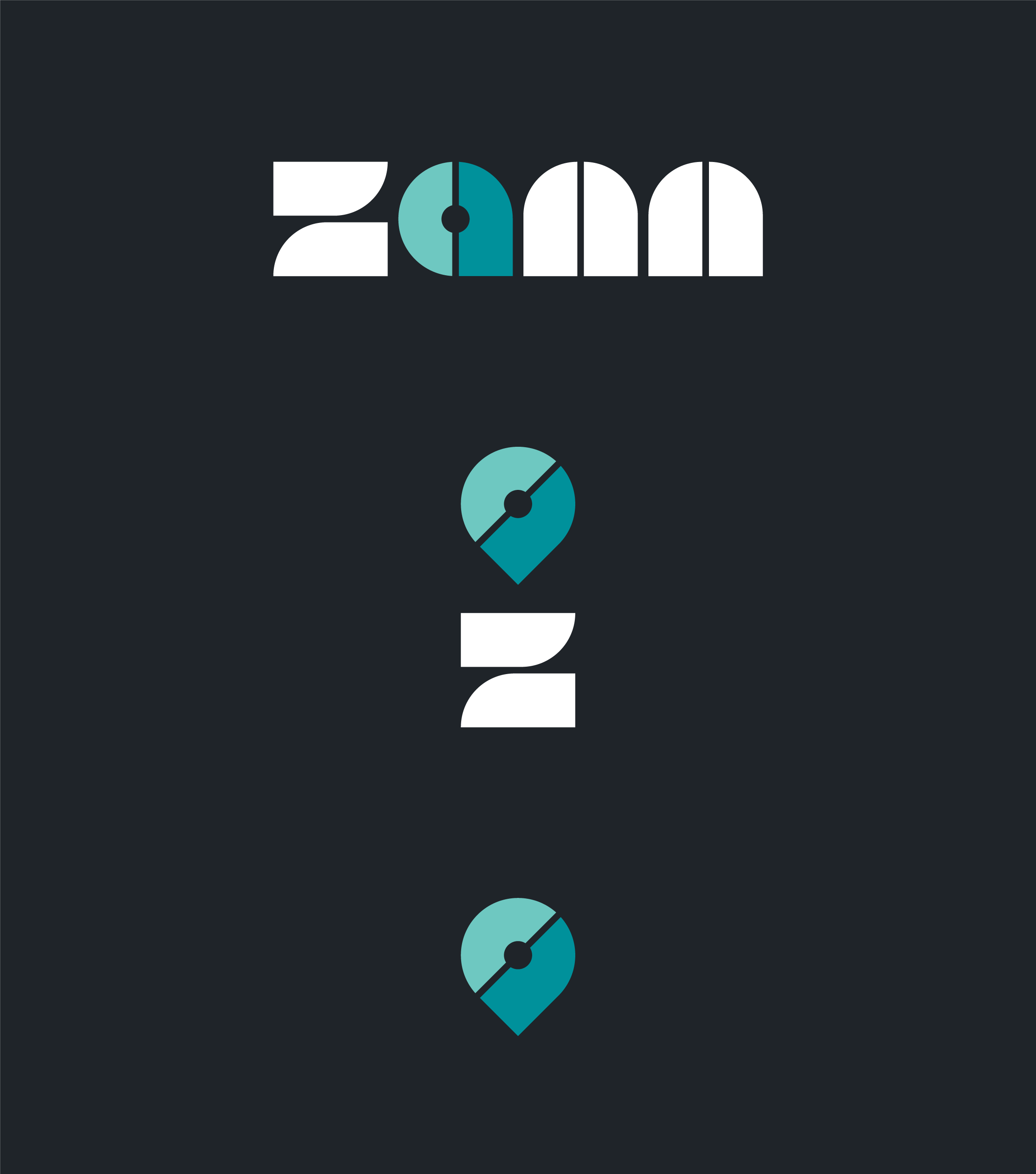
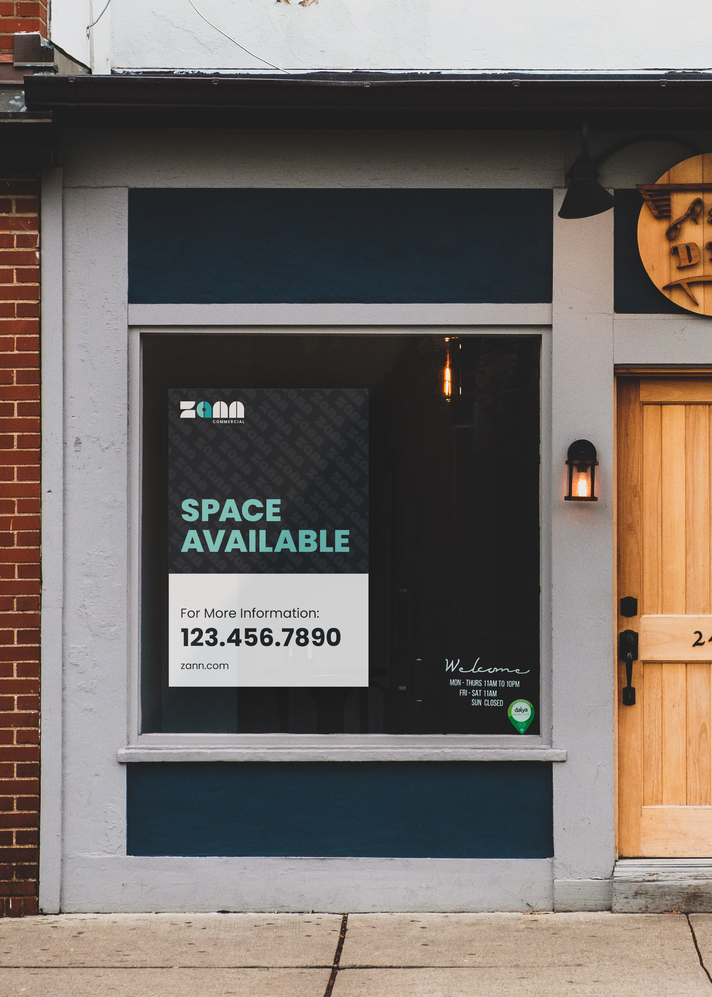
The result is a monotype lowercase wordmark with distinctly retro character, paired with an icon that serves dual purpose. It functions as the "a" in "zann" while acting as a map pin, a visual shorthand for location-based commercial real estate.
The icon became the new hero: contemporary, functional, and a literal representation of Zann's core business. By keeping the signature teal but reimagining how it's used, we created a brand that feels both familiar and entirely new.

Carbon
HEX
#1f2429
RGB
31, 36, 41
CMYK
24, 12, 0, 84
Lab
14, -13, -6
Dark Cyan
HEX
#00919b
RGB
0, 145, 155
CMYK
100, 6, 0, 39
Lab
60, -259, -11
Sea Foam
HEX
#6ec8c1
RGB
110, 200, 193
CMYK
45, 0, 4, 22
Lab
81, -152, 0
Apricot
HEX
#f59232
RGB
245, 146, 50
CMYK
0, 40, 80, 4
Lab
61, 147, 67
Pearl
HEX
#fbfbfb
RGB
251, 251, 251
CMYK
0, 0, 0, 2
Lab
99, -8, -6
Implementation & Results
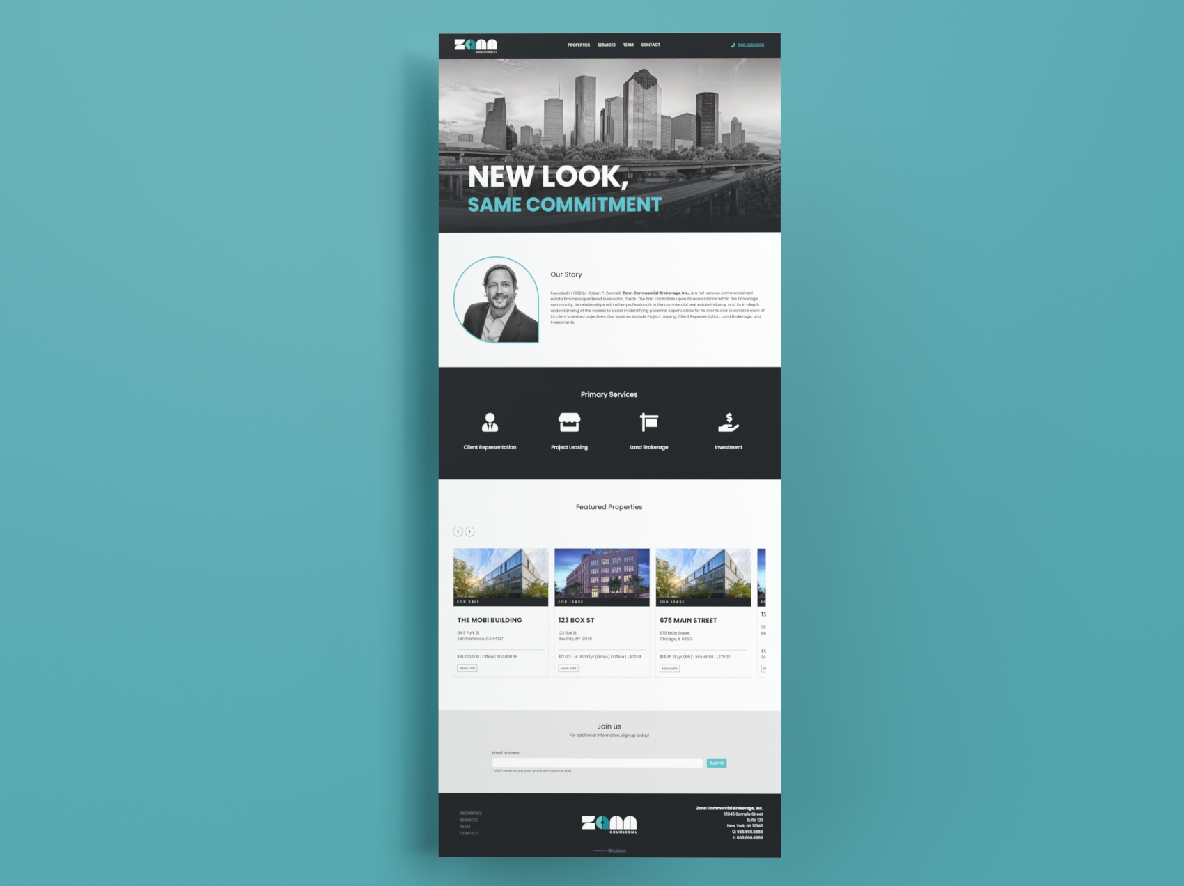
The new Zann identity rolls out across digital platforms, collateral, and market materials. The lowercase, retro-inflected wordmark signals approachability and contemporary thinking, while the map-pin icon immediately communicates expertise in location-based CRE services.
The teal connects past to present, creating continuity rather than rupture. What emerged is a brand that tells a story: one of respect for foundation, confidence in new leadership, and vision for growth.
Long-term Impact
The Zann rebrand succeeded in its core mission: signal transition without erasing legacy. The new identity positioned the firm as a forward-thinking player in the Texas CRE market while leveraging the trust and familiarity already established in the community.
More importantly, it gave new leadership a visual platform to build their vision. The retro-modern aesthetic appeals to a demographic that values both heritage and innovation, attracting younger investors and tenants while maintaining relationships with established institutional clients.
The dual-purpose icon has become a distinctive signature across all touchpoints, creating immediate recognition and clear communication of Zann's location-focused expertise in commercial real estate.
Ready?
Let'sbuildsomething
withstayingpower
We don't offer quick fixes or cookie-cutter solutions. Instead, we focus on creating thoughtful, strategic creative solutions to honor the hard work you're already doing and get you the results to match.