This passion project explores a fictional coffee roastery facing a real industry challenge. Ten years ago, climate crisis disrupted industrial coffee supply chains, and the industry did nothing. Imagine a coffee representative deciding she would. Tempest Coffee Roasters emerges as a thought experiment in brand-building for disruption: cut out middlemen, work directly with suppliers, roast every batch by hand in-house. The question: how do you build visual identity for a company rooted in refusing compromise?

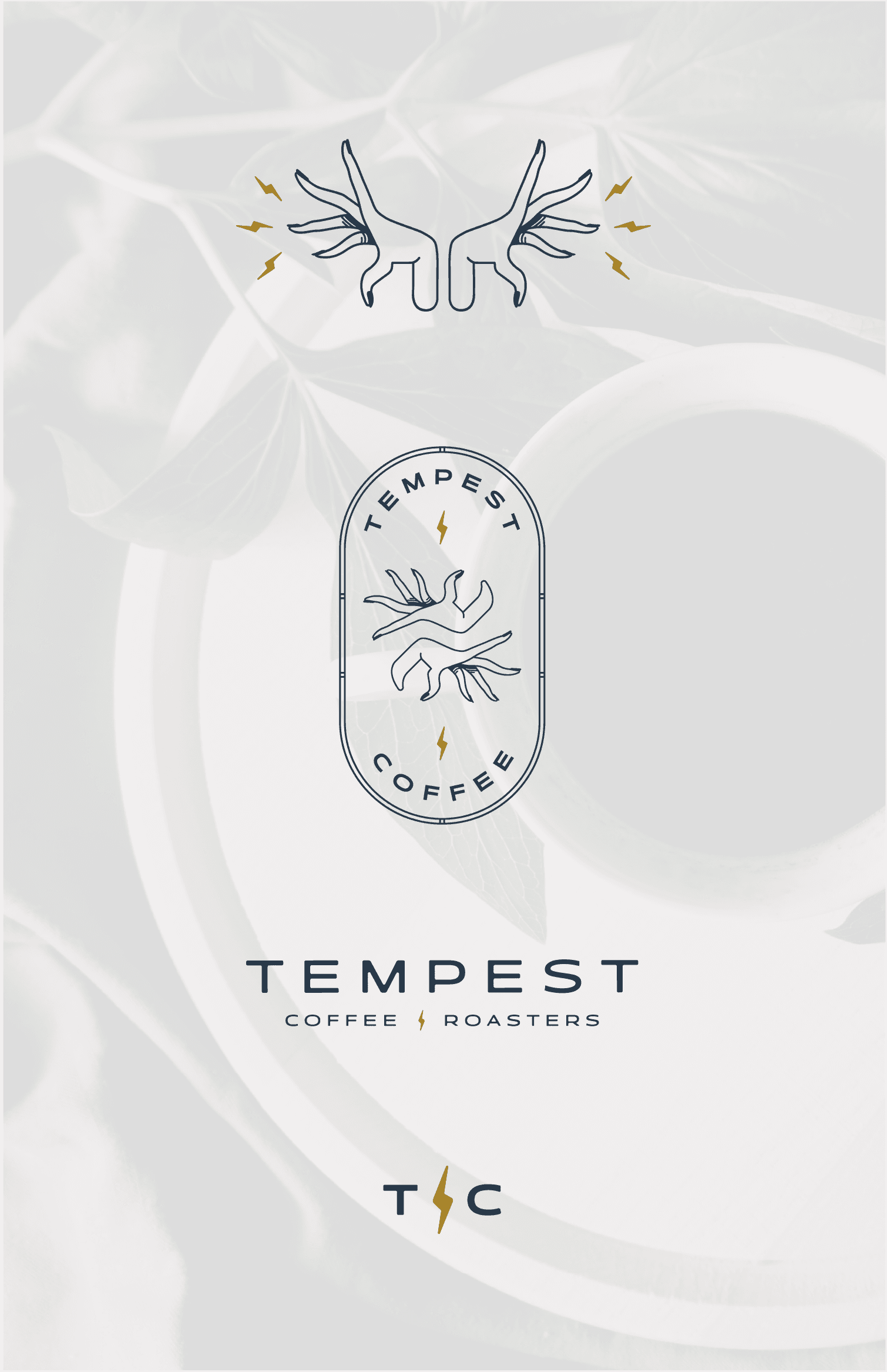
Primary Logo

Alternate Logo
The Challenge
Building an identity for a hypothetical woman-owned roastery requires visual language that signals defiance without apology—one that honors authentic female leadership and communicates a supply chain philosophy most consumers haven't considered. The brief was straightforward: create a brand matching the founder's conviction. Dark, direct, unapologetic. One that stands apart from the carefully curated, Instagram-friendly aesthetic dominating specialty coffee, while still appealing to consumers who genuinely care about sourcing and sustainability.
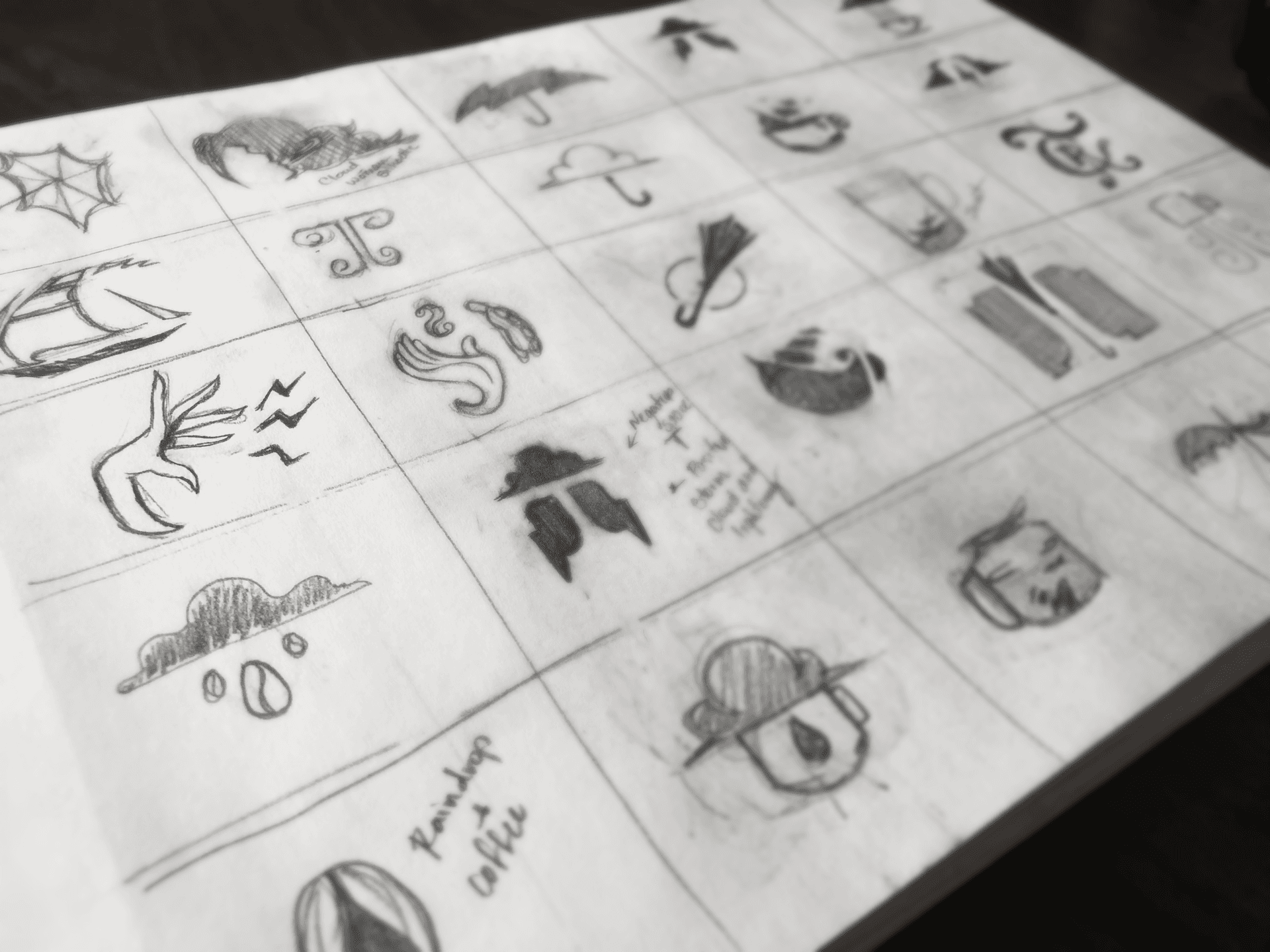
The Strategy
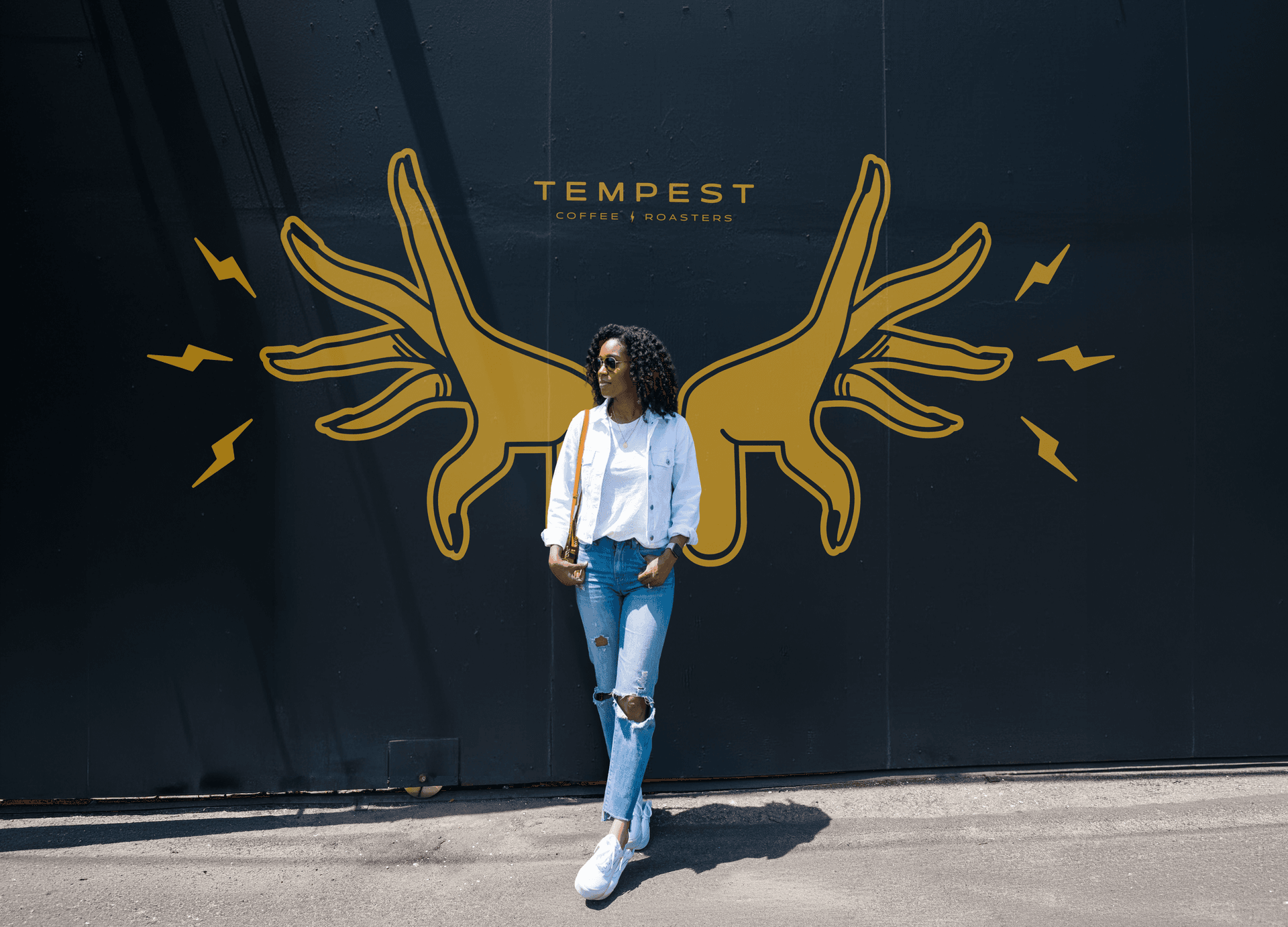
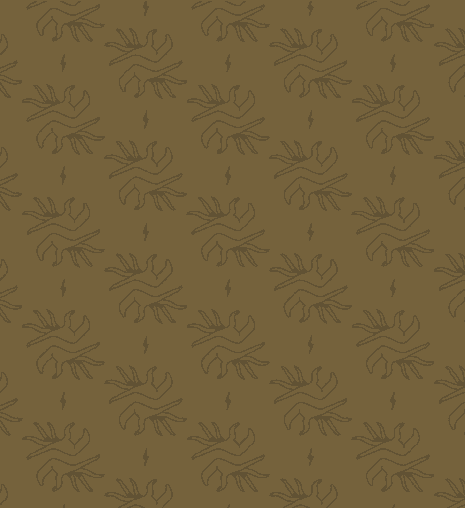
The Tempest identity concept begins with darkness and conviction. Deep, moody typography paired with striking visual elements creates immediate urgency and power. The name carries dual meaning: a literal storm disrupting traditional agriculture and industry, and a metaphorical awakening drawn from classical literature. The tagline—"Awake, dear heart, awake"—reinforces both the disruptive spirit and connection to coffee culture, while centering the female founder's vision. Rather than embrace the softness and pastels common in specialty coffee branding, the color palette and typographic system reflect unapologetic boldness. Every element communicates principle over trend. The visual system is designed to extend naturally across product packaging, signage, social media, and environmental design, creating cohesive messaging that reinforces the core narrative: coffee roasted with intention by someone who refuses to compromise.
Ink Black
HEX
#0d1214
RGB
13, 18, 20
CMYK
35, 10, 0, 92
Lab
5, -9, -2
Charcoal Blue
HEX
#2b3c4d
RGB
43, 60, 77
CMYK
44, 22, 0, 70
Lab
25, -36, -15
Dark Khaki
HEX
#75623c
RGB
117, 98, 60
CMYK
0, 16, 49, 54
Lab
42, 28, 26
Goldenrod
HEX
#d69f22
RGB
214, 159, 34
CMYK
0, 26, 84, 16
Lab
65, 79, 89
Silver
HEX
#c5c2c3
RGB
197, 194, 195
CMYK
0, 2, 1, 23
Lab
78, -2, -5
The Conceptual Execution
This visual system would launch across three Chicago locations—from storefront signage to bag design to digital platforms. The dark, bold aesthetic immediately signals differentiation in a category dominated by warm minimalism. Customers encounter a brand that feels as serious about its supply chain as it is about the coffee itself. The identity becomes shorthand for a philosophy: direct relationships with suppliers, in-house roasting, and unwavering commitment to doing things the right way regardless of industry pressure.
What This Exploration Reveals
This hypothetical project demonstrates how strategic brand identity can communicate complex values—female entrepreneurship, supply chain transparency, industry disruption—without relying on the visual clichés of the specialty coffee category. It showcases an approach to branding that prioritizes authentic differentiation and unapologetic positioning. The work explores how visual language can reinforce a founder's core conviction: that refusing to compromise isn't a limitation, it's a feature. In a category built on carefully crafted warmth, Tempest's darkness becomes its most distinctive asset. The brand identity doesn't soften the disruption—it amplifies it.
Ready?
Let'sbuildsomething
withstayingpower
You work hard; so should your brand. Every day it's not delivering for you and your business is a day that it could have been. Let's talk.